PRESS RELEASE
Hardline
Feb 1 – Feb 26, 2017
Everard Read/CIRCA is pleased to present HARDLINE, a group exhibition opening 1st February at CIRCA Cape Town.
This selected exhibition includes artworks by Amber-Jade Geldenhuys, Andrzej Urbanski, Jo O'Connor, Richard Penn, Paolo Bini and Sandile Radebe.
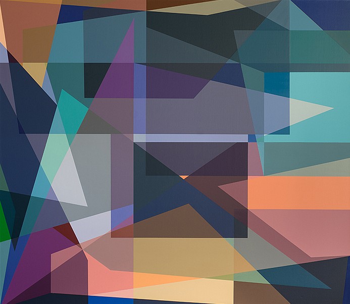
HARDLINE aims to introduce a succinct but varied group of painters and sculptors, whose actions and considerations result in a solid yet fluid variety of hard-lined abstract languages. These artists seemingly merge both gesture and design in structural formality, the visual results of which refer to designated bold areas of colour, sharp surfaces and minimal or repeated geometric shapes.
The investigations vary greatly originating from urban, landscape and scientific based starting points, the notions of languages and writing systems and the ‘democratizing of the maker’. Cultivating contemporary conversations/languages with a hard-edged[1] clarity and sharpness, each artist’s distilled observations result in their version of a rich, concise abstraction. Some exist as coloured forms and defined edges in painting and, in the sculptures, a minimal and clean formality.
Amber-Jade Geldenhuys’ s 2017 Transformer sculptures can be constructed or changed by anyone. A series of modular stainless steel triangles, they are bolted together to form organic geometric objects. Like a beehive, these triangles allow construction in an intricate maze of information. For the artist, this action can be done by anyone to ‘destabilize the sole role of the artist’. A conceptual role-making that is increasingly important in Geldenhuys’s practice, the artist plays with the functionality of objects. Here concepts like collaboration have become increasingly important (most recently in the 2016 Material City exhibition’s Wall installation). As abstracted objects, they are ‘created with aesthetic contemplation but can be disassembled and reassembled into utilitarian objects like chairs and tables’. They speak of infinite modularity and have the potential to keep growing and creating symmetrical rhythms or unique patterns.
Andrzej Urbanski's authenticity lies in his desire and ambition to secure the perfect surface - one which balances richness of colour and movement of ‘frequency’ across a 2-dimensional language. Directly influenced by urban space and with his unique predetermined compositions, there is a refined distillation of what is observed and understood around him. A canvas such as A036-113-96-16 could at first appear random. This fluidity is because of Urbanski’s astute understanding of how each form, colour and shape engages with the other. Their numerical titling emphasises production processes and the crucial nature that information conceptualisation plays for him. But this too serves to acknowledge the formal abstract nature of his working process: where bright colour and flat surfaces collide within experimental order and design. The 3-dimensional monochromatic sculptures such as B04 6/1/2016 give Urbanski scope to expand his languages without deviating focus from the colourful references in his paintings. By choosing to engage solely in black sculptural forms, the artist gives the audience permission to compare each language he uses without diluting their potency.
Jo O ‘Connor’s paintings utilize urban environments as a palette for colours, patterns and shapes that recall cellular, architectural and man-made structures. This constructed ‘camouflage’ serves as a social commentary on humans and what has become, for many, their ‘natural’ environment. Camouflage for Suburbia, 2016 and City Cloak, 2017 demonstrate in clearly delineated areas that ‘perhaps urban camouflage is concerned with negotiating the violence of life, the fight to survive or be ‘successful’. For O ‘Connor, ‘perhaps it speaks of the desire to hide oneself from the discord of urban life, as if protecting oneself from danger in the wild’. The neat surfaces that are created with thin layers of acrylic paint, strive with a desire to retain ‘the integrity of shape and color’. This use of transparent intersections pulls and pushes as layers. In turn, this serves as a metaphor for the artist, denoting both the acts of concealing and revealing. O’ Connor explains: ‘a veil of translucency that belies the art of disguise - it affords a deeper understanding of the surface and what lies beneath. It is through this that we view a process of metamorphosis’.
Richard Penn oscillates in a semi-fluid manner between macro and microcosmic worlds. In this series of complex and multifaceted paintings titled after Guinevere Glasfurd-Brown’s short story The Word for it, Penn contemplates the ‘impossible intricacy of the very large, the very small and the very distant in both space and time through colour and abstract visual complexity.’ Set in a place and time when human beings have lost the ability to manufacture colour, the character's subsequent inability to ‘describe certain colours brings about a devastating sense of loss and anxiety’. Penn explains that he feels ‘a similar sense of anxiety and inadequacy when confronted with the beautiful yet ungraspable descriptions of reality as it is described by contemporary science’.
Paolo Bini’s research is an investigatory attempt to transform and re-appropriate the authentic notions of ‘the memory of an image’, of the contemporary rhythms in the natural world around us. Images are formed as a pixelation of units, usually marked out by a scanner or a plotter. The result here is a succession of coloured ‘stripes’ that become a concise translation redefining what came before. Working with ‘painting', the paint is almost always applied to masking tape, and then onto media such as cotton canvas or polystyrene shapes. This creative process in which Bini rearranges these ‘pixelated lines’ is done ‘with a particular reflection on the abstract spatial formation of the image’. The aim with the smooth surfaces is to try to recreate the sensations and emotions that originally spurred its creation. The sculptural-like edges of the tape (imbued with layers of paint) serve to reinforce the notions of hard edges that divide up his narrative.
Influenced by everyday encounters with language, Sandile Radebe’s process of reading, accumulating and retaining information, result in artwork that is centered around text, language and other writing systems. His engagement with text delves into urban environments, histories, culture, politics, identity and every other aspect of human interaction. Radebe explains that ‘through manipulating the form of text through exaggeration and/or through translating it into other media, I consider various forms to see them anew. These translations create an experiential sense of text or sometimes accentuate the aesthetic beauty inherent in text. Here Industria town, 2016 and Mista Puzzles, 2017 unpack the formality of text onto board as flattened abstracted shapes and designs. Mashiya amahle, 2017 (Radebe’s clan name) is transcribed literally into lettering that makes up a sculptural cardboard form. The card curves in such a way that it can also spell other words depending on how it is read. This process for the artist echoes a literary analysis in how it seeks to unpack concealed meanings in a subject. Similarly, for Radebe his ‘manipulation of text is an attempt to bring the subtle politics involved in the process of writing, and how information is presented to us, to the fore.
The exhibition will run until the 26th February 2017.
A portfolio is available upon request.
[1] Hard-edge’ painting style has always been directly synonymous as a 1960 term related with the original Geometric abstraction, Op Art, Post-painterly Abstraction, and Colour Field painting. A term was coined by Los Angeles Times art critic Jules Langsner also a writer and curator and , along with Peter Selz, in 1959. It was originally used to describe the work of painters from California, who, in their reaction to the more painterly or gestural forms of Abstract expressionism. https://en.wikipedia.org/wiki/Hard-edge_painting